WebTuna Map
The purpose of the dashboard is to give a geographical representation of where users are located and also to provide further information on each individual user.
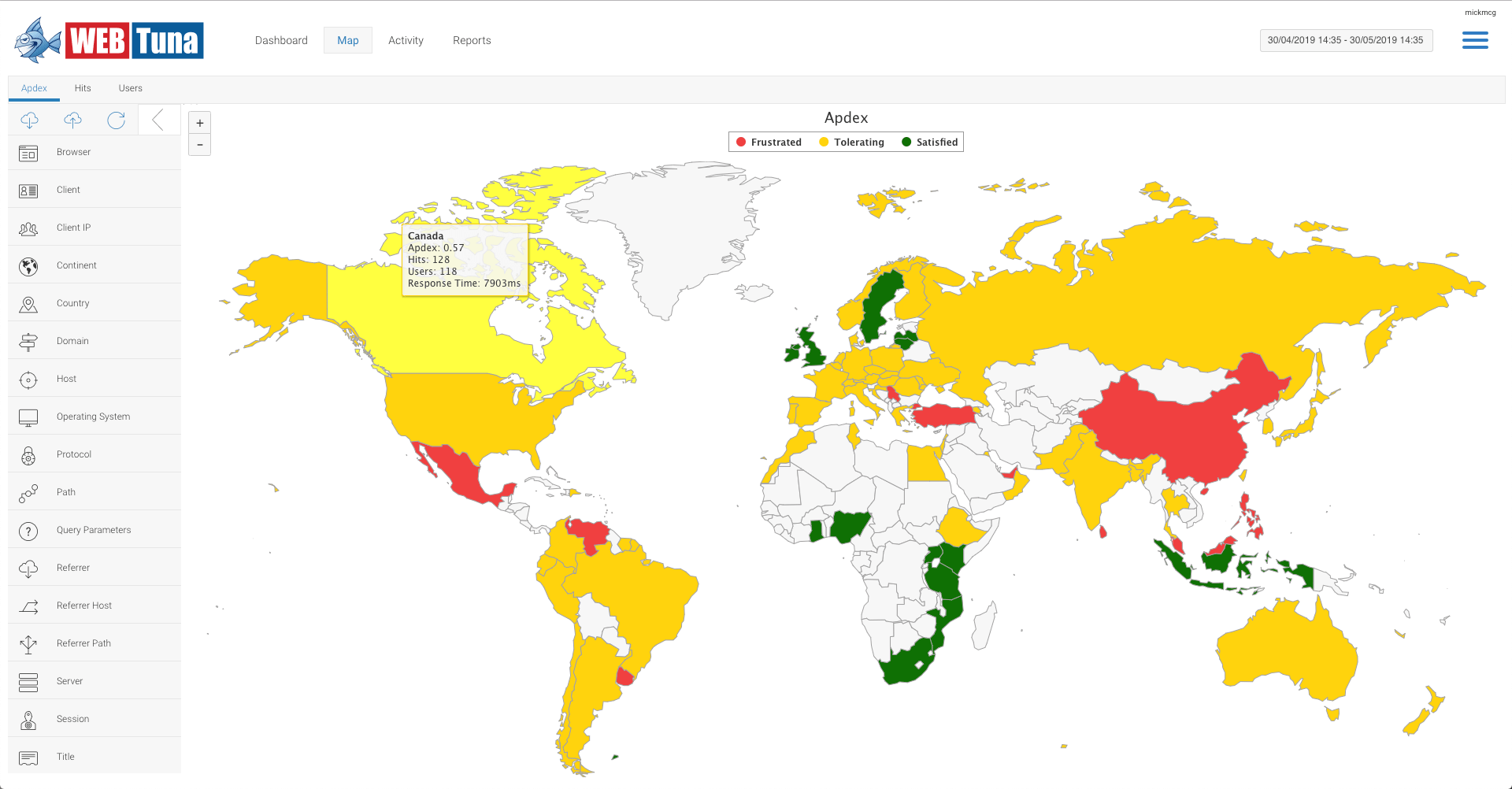
Apdex view
The Apdex view shows the performance experience by users around the world. The color coding is based on the Apdex score for each country which is calculated by evaluating every request and categorising the user experience it as Fustrated, Tolerating or Satisfied. The overall score is calculated as a figure between 0 and 1. You can see the Adpex score as well as Hits, Users and Response time by hovering over each country.

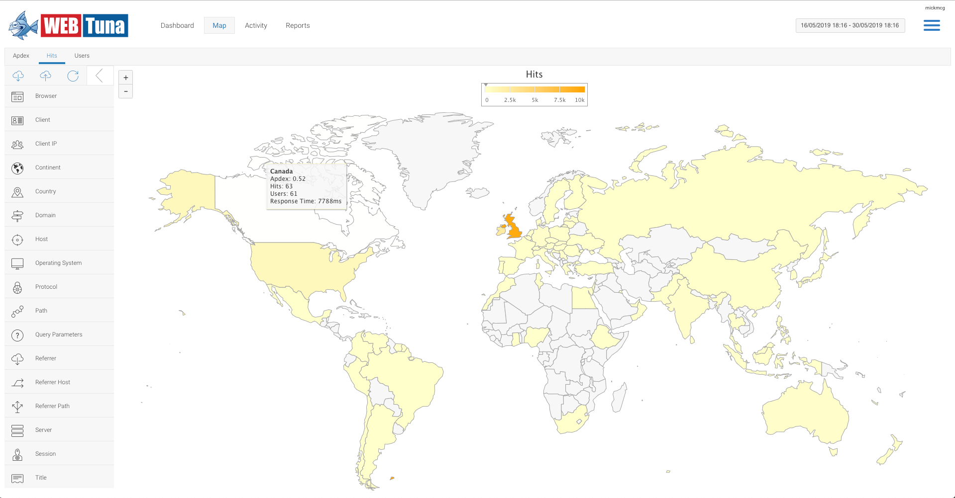
Hits view
The Hits view shows the request count by users around the world. The color is darker for countries with more hits. You can see the Adpex score, Hits, Users and Response time by hovering over each country.

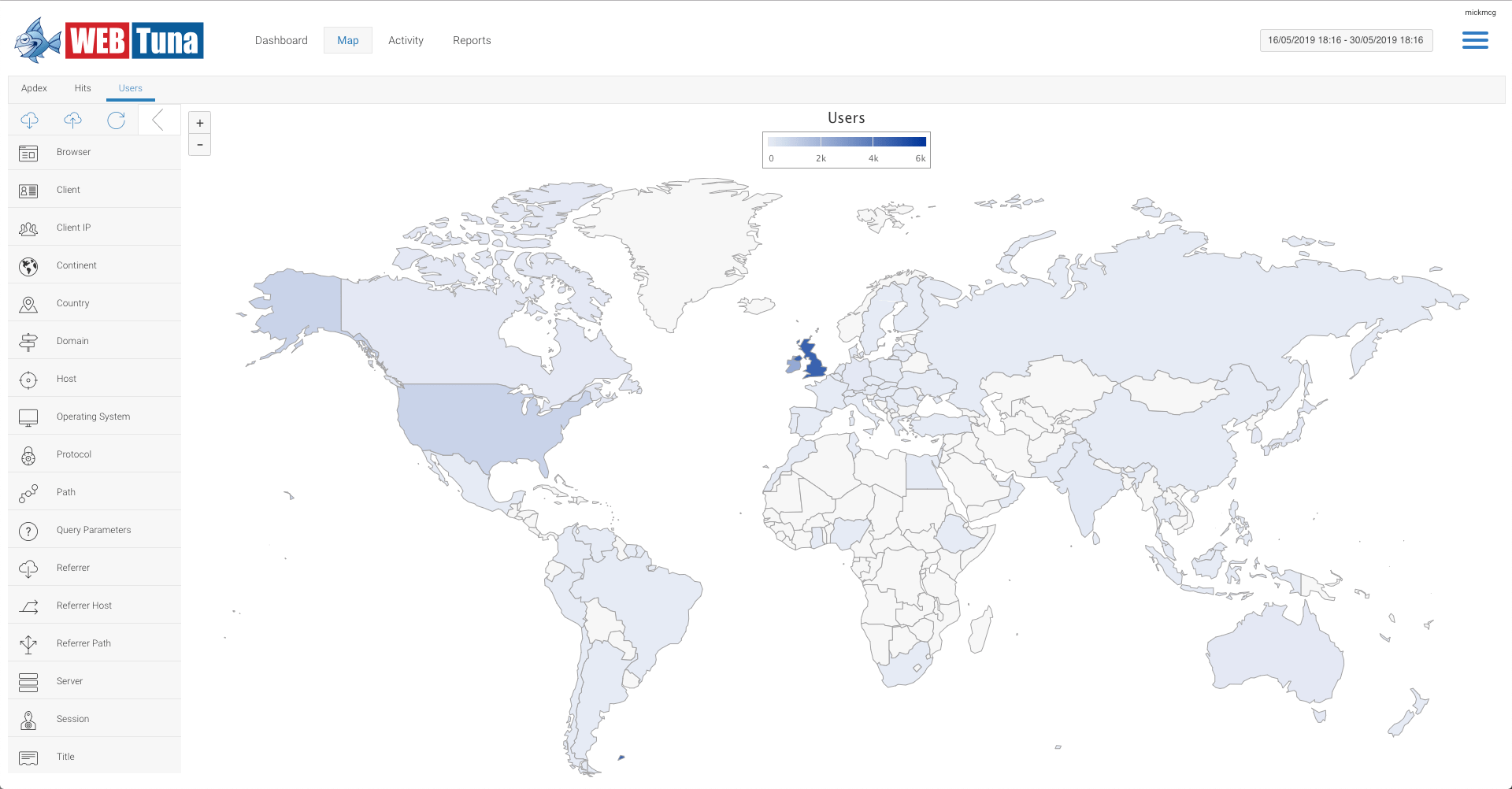
Users view
The Users view shows the unique user count by country. The color is darker for countries with more users. You can see the Adpex score, Hits, Users and Response time by hovering over each country.

